Fresh new brand ID for next level growth
Developing a brand identity to take a small design agency to the next level
Hunter Lodge Design Ltd
In the late 1990’s Hunter Lodge Design was a small, traditional marketing and design agency established long enough to have a good reputation with a limited local clientele, but building in strength and keen to expand its service offering.
I was brought on board to establish a New Media division. Tasked with developing digital sales tools and expanding the service offering I recognised that the existing brand, which was little more than an amateur logo on letterhead, would be a disadvantage.
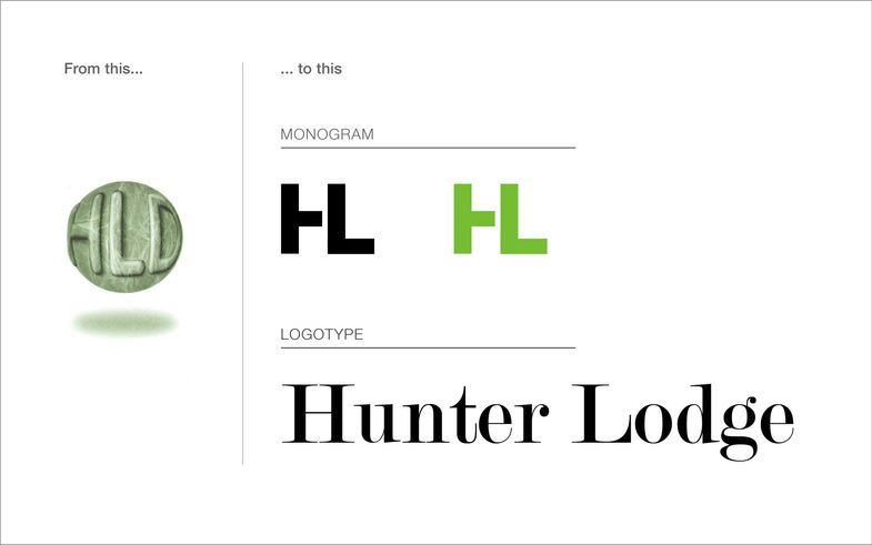
As is often the case with small design agencies, the team was too busy with daily delivery to think about their own brand so, I took the reins and created an identity to serve my needs when developing products, and provide the framework for growing the company portfolio.
It had two core brand assets that worked together:
-
The HL logo mark was modern, strong, compact and clear. Easy to work with as shorthand for the full company name and practical for use on digital products. It worked flexibly in contemporary advertising campaigns designed to be current and eye-catching.
-
The Hunter Lodge logotype, in contrast, added gravitas to the identity giving the brand a sense of heritage and longevity.
The combination of the modern with the timeless reflected both the company culture, and its aspiration for how it wanted to be perceived by the market. The new brand and portfolio expansion galvanised the team and improved staff engagement – shifting mentality from that of a small design agency to marketers and creatives who could take on the world.
25 years on, I’m proud to have watched the company go from strength to strength to become an award-winning full-service advertising agency. The logotype has stood the test of time and remains largely unchanged!
Credits:
HL Design team


